top of page
B&B儿童洗护品牌
包装设计
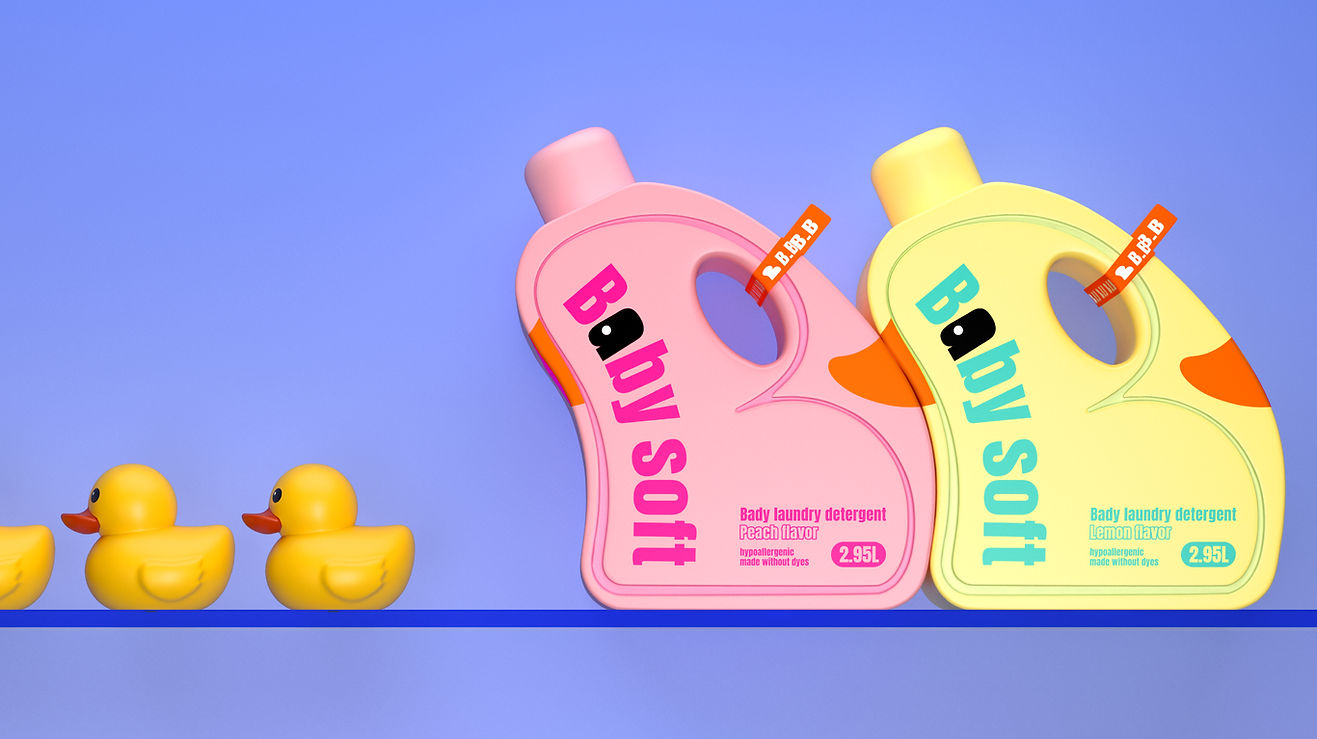
B&B儿童洗液品牌提倡趣味与亲和,我们希望建立独特的视觉语言,与市面上儿童洗护品牌产生差异,在瓶型与视觉设计上采用了正负形排列方式,形态来源自喜爱度极高与经常在儿童洗澡&洗衣场景出现的小黄鸭,品牌名称与卖点以最大化方式呈现,色彩选择较温和并丰富的彩色,同时在把手处配有品牌label。互动性的小黄鸭形象、丰富的色彩与强识别、差异化的阵列感瓶型可以更好的在终端货架上呈现。
The B&B children's lotion brand advocates fun and affinity. We hope to establish a unique visual language, which is different from the children's care brands on the market. The positive and negative arrangements are adopted in the bottle shape and visual design, and the shape comes from the extreme love. Gaohe, the little yellow duck that often appears in children's bathing and laundry scenes, maximizes the brand name and selling points, chooses milder and richer colors, and is equipped with a brand label on the handle. The interactive little yellow duck image, rich colors and strong recognition, and differentiated array-like bottle shapes can be better presented on the terminal shelves.


bottom of page